In this article, we will see how to use a combination of data modelling and DAX query to make a report with dynamically changing columns.
Introduction:
We all know how powerful power BI is when it comes to data handling and visualization. But often a times requirements come around from various clients to make a KPIs or visuals with features or functionalities which are not present out of the box. Mostly it’s from clients who are using Excel as their reporting tool to do various operations and manipulations on the excel tabular data to meet the requirements of their business. Hence, developer needs to do some magic to meet their requirements. As most of the pro developers are aware, this all boils down to a creative DAX and data model. So, let’s see what the problem statement was there which inspired me to make a matrix chart with dynamic column headers.
Problem statement:
A client reached out to me to make an attendance report of the entire organization. They were creating their reports on Excel using SQL data dump as the data source. The Attendance table contained daily records of the employees having in time, out time, present, absent or weekend data. The final excel report was a matrix having following format as represented in Fig-1.
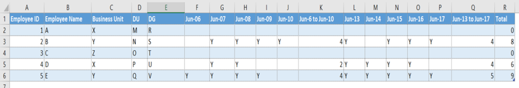
Fig-1: Final Excel Report that client was currently making
End Results:
We modified the report slightly that would go well with power Bi without major data model modifications. This is how our final report would look like.
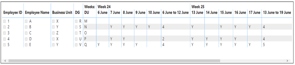
Fig-2: Our Power BI report
Solution:
For making the above matrix report in Power BI, we are going to use a sample data that I created in excel. First is out fact table having columns: Employee ID, Employee name, Date, Login Time, Logout Time, Status. And we have a master table containing employee data like Employee Name, ID, Email, location, business Unit, DU, DG etc. Fig-3 and Fig-4 shows the data we created in excel for our report.
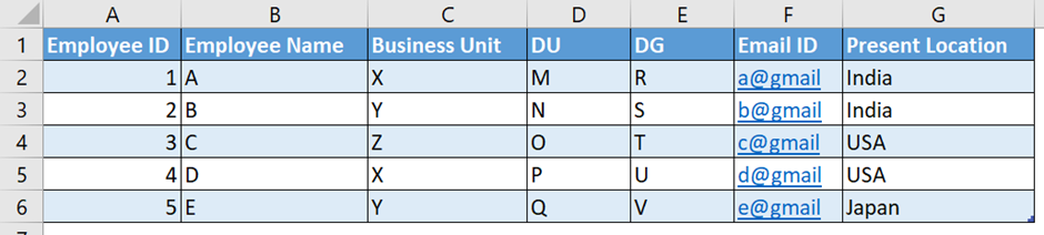
Fig-3: Employee Master
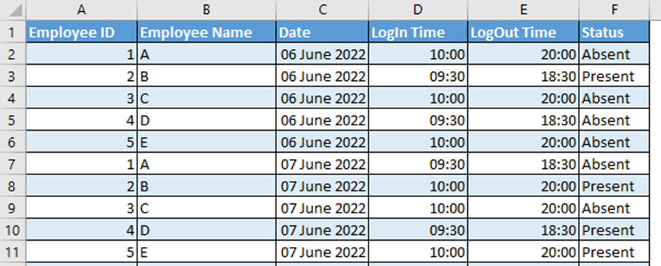
Fig-4: Attendance Fact table
Now next obvious step is to import this data into Power BI and make connections between tables as shown in Fig-5.
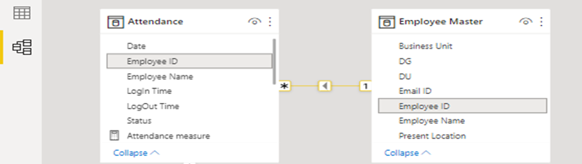
Fig-5: Joining Employee IDs of both tables
Next step is to make a Date dimension table “Dim_Date” as shown in Fig-6. For simplicity I have kept only two columns: “Date” and “Weeks:”. There is a reason to name our week column as “Weeks:” which I will explain in some time.
The ‘Dim_Date’ table contains all distinct dates and their corresponding week.
For making this week column simply use this DAX logic:
Weeks: = “Week ” &WEEKNUM(Dim_Date[Date],2)
In the WEEKNUM() function above, the second argument specifies form where the week would start. 2 represents that the week starts from Monday. Default argument is 1 which means that week starts from Sunday as it first day.
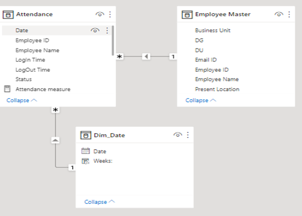
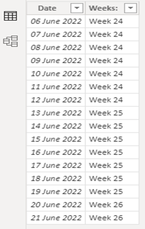
Fig-6: Dim_Date table
I like to explain everything in step-by-step manner. You need to understand why and how it happened. Let’s start making our Visual now. First, we will drag the matrix visual into our canvas and select Rows and Columns for the chart. Rows are basically the dimension across which you want to view your values. In our case we are choosing fields from Employee Master as our rows for this visual. Please see Fig-7 for reference.
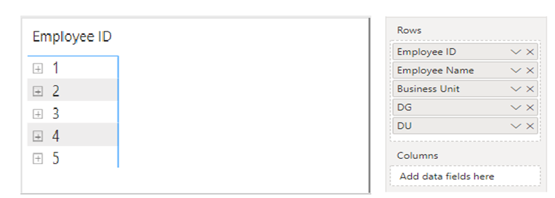
Fig-7
Right now, you only see ‘Employee ID’ in your visual, do not worry because all fields are collapsed by default. We need to expand to the last row i.e. ‘DU’ which is short for Delivery Unit. Use ‘Expand’ option given in the visual header. By default, the expanded matrix would appear in stepped layout as shown in Fig-8.
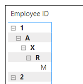
Fig-8: Default expanded view
To fix this, you need to turn off stepped layout option. For this, click on your visual and simply go to ‘Format Visual’ option in Visualizations pane. Expand ‘Row headers’ and turn off Stepped layout as shown in Fig-9.
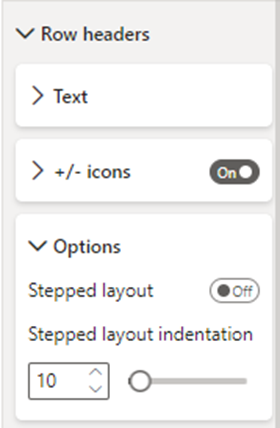
Fig-9
Your Matrix graph would now look as in Fig-10.
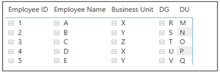
Fig-10: Final layout in our expanded view
Now we need to work on Columns part of the matrix where we would be displaying everyday attendance. Attendance need be displayed for each day along with the corresponding week’s total attendance, hence is it comfortable to display data in week and day hierarchy. For displaying weeks, we need to select ‘Weeks:’ field or column from our ‘Dim_Date’ table. After doing this step, our report would look as shown in Fig-11.
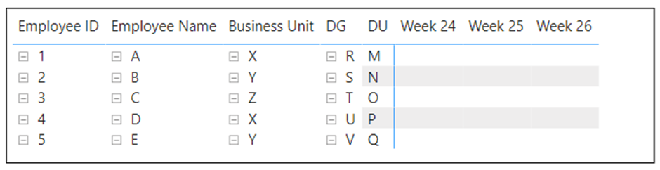
Fig-11
Now for each week, we need to show all the days when the employees were present and total attendance of that week as per client’s format. This is not as simple as dragging ‘date’ column from the Dim_Date table and showing results. We need to show “Y” when the employee was present and Blank when he was absent, and then display total days or total attendance for that week as shown in Fig-1.
For better understanding, lets look at the output we will get when we drag and drop ‘Date’ column from ‘Dim_Date’ table in columns field of the visual, and simply select the count of ‘status’ from attendance table. See Fig-12. Let’s only keep column subtotals for our report.
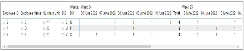
Fig-12
We see that the count is 1 wherever the status was present, but we need “Y” whenever someone was present and, we have weekly total, but we need the total of the week number as header in our report. We need to make a measure and a different approach for our purpose.
As I previously mentioned, such peculiar reports are nothing but the play of DAX and data model. We obviously need to think out of the box to make such reports in Power BI since Power Bi is a developing BI tool and comes with its own limitations. In our scenario, we need to replace ‘Total’ header with custom header like ‘6 Jun to 12 Jun’ which also needs to change dynamically for every week.
Let’s work with the header problem statement for now. We need dates and week date range as our headers. We will need to make another date table ‘Dim_Date2’ for this. We are going to make a calculated table by feeding the following Dax expression.
Dim_Date2 = UNION(addcolumns(CALENDAR(min(Attendance[Date]),max(Attendance[Date])),”Weeks:”,”Week “&WEEKNUM([Date],2)),crossjoin(row(“Date”,date(2200,01,01)),SUMMARIZE(Dim_Date,Dim_Date[Weeks:])))
This will result in a table as shown in Fig-13. To make ‘Matrix Column Header’, Use the following DAX in a calculated column. We are going to use this column in our visual. Also please sort this column w.r.t Date column.
Matrix Column Header =
Var W =calculate(max(Dim_Date2[Weeks:]))
Var MinD = format(minx(filter(Dim_Date,[Weeks:]=W),Dim_Date[Date]),”d mmmm”)
Var MaxD = format(maxx(filter(Dim_Date,[Weeks:]=W),Dim_Date[Date]),”d mmmm”)
return
SWITCH(TRUE(),
[Date]<>date(2200,1,1),format([Date],”d mmmm”),
MinD & ” to ” & MaxD)
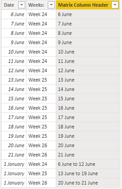
Fig-13
Let’s now drag this column in our Visual in columns section below ‘Weeks:’ as shown in Fig-14
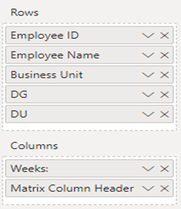
Fig-14
But after we do this, our visual will throw an error as in Fig-15.
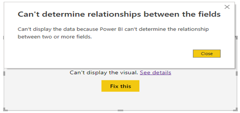
Fig-15
This error is because ‘Dim_Date’ and ‘Dim_Date2’ are not connected. We are going to keep ‘Dim_Date2’ as a disconnected table on purpose. To fix this, lets make a measure ‘Attendance’ and put its value as 1. The error will be resolved and our visual would now look like that in Fig-16. We are also going to disable column subtotals now as its not needed now.
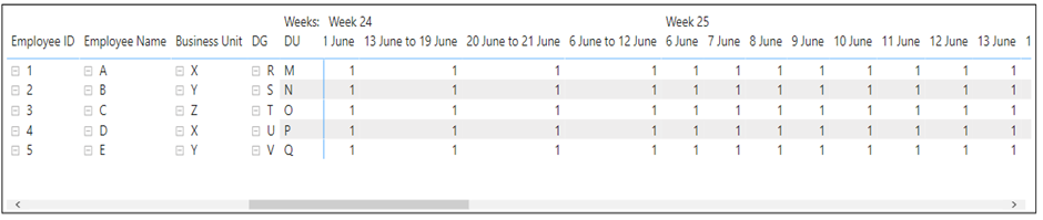
Fig-16
As you can observe, we are seeing all the values of Matrix Column Header under all the weeks of ‘Dim_Date’ table. We now need to modify our measure to give proper values under each week.
Use the measure below to get expected results:
Attendance measure =
var dimw =SELECTEDVALUE(Dim_Date[Weeks:])
var filw =SELECTEDVALUE(Dim_Date2[Weeks:])
Var WT = SELECTEDVALUE(Dim_Date2[Matrix Column Header])
Var Daily =CALCULATE(count(Attendance[Date]),format(Attendance[Date],”d mmmm”)=WT,Attendance[Status]=”Present”)
Var WeekTotal =CALCULATE(count(Attendance[Date]),Dim_Date[Weeks:]=dimw,Attendance[Status]=”Present”)
Var C3 =CALCULATE(count(Attendance[Date]),Dim_Date[Weeks:]=filw)
Var MinD = format(minx(filter(Dim_Date,[Weeks:]=filw),Dim_Date[Date]),”d mmmm”)
Var MaxD = format(maxx(filter(Dim_Date,[Weeks:]=filw),Dim_Date[Date]),”d mmmm”)
Var range = MinD & ” to ” & MaxD
return
switch(true(),dimw=filw && Daily<>blank(),”Y”,dimw<>blank() &&WT=range,format(WeekTotal,”##”),BLANK())